|
tat2ter |
2010-10-11 |
| couldv been better although it looks good and an improvment on the old 1 like the colors ........... |
 |
Aaron |
2010-03-26 |
| Not my style, but certainly an improvement. |
 |
bitchass |
2009-10-24 |
| hmmm...should have stuck with the original tattoo. looks better than the new piece of shit. |
|
Tremendous |
2006-11-02 |
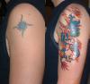
| Looks to me like the old ink has been converted to horns on the dragon. Fine work. |
 |
The 24s Pookey |
2005-08-03 |
| Shitty dragon/glow worm. |
|
link |
2005-05-30 |
| i see it too...dont like cover ups where you can see the old ink inside or around.....sorry but i have to say it blows |
|
Happy Girl |
2005-05-06 |
| I think it looks great. Love the Color |
|
Debi |
2005-05-05 |
| Beautiful work. |
|
Kirsten |
2005-01-26 |
| does no one else see the bit coming out of the dragons head that isn't covered up? maybe i'm the only one who thinks it looks really odd... like the rest though. |
|
pebbles |
2004-09-14 |
| sorry to say, i liked the sun |
|
huchee |
2004-08-19 |
| hella good cover up |
|
appstateisdoodoo |
2004-02-26 |
| great colors, hope that doesn't fade |
|
omriamird |
2003-09-28 |
witch one is the cover up?
;)
nice work! |
|
kymajo |
2003-09-27 |
| nice work, what does the writing symbolise? |
 |
inkylady |
2003-08-19 |
| Bigger better bolder ! its got every thing |