|
Jim |
2011-03-11 |
| will be cool but I agree higher and no wording |
 |
Neg |
2007-01-11 |
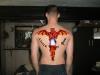
| i agree to say it should be a bit higher, with no text.The dissymetric placement of the hands makes it nice too, removing it would be a mistake as it was said below. |
 |
Jesse |
2006-09-26 |
| If your name means little fiery one then the tat alone (without the words) means exactly what you want to say. I think the words would make it redundant and i think its great without them as well. |
 |
RATTLEHEAD |
2006-06-11 |
| ...and leave the hands exactly where they are \m/ |
|
RATTLEHEAD |
2006-06-11 |
| If you haven't got it inked already my advice is hurry up and do it... it looks cool but... needs to be about an inch higher up your back and forget the text it will ruin the tattoo... |
 |
lucky lee |
2006-01-18 |
| this is a site for rating tattoos note stuff that u havent had done 1 |
|
lostsoul_tat |
2005-10-10 |
| Not to be mean but some might have the joke to use as "little flamer" I think you should come up with something a little more demonic. Look up angels... Dante's Inferno, even the movie Constatine had some great saying in accord with the devil. |
|
lostsoul_tat |
2005-10-10 |
| Not to be mean but some might have the joke to use as "little flamer" I think you should come up with something a little more demonic. Look up angels... Dante's Inferno, even the movie Constatine had some great saying in accord with the devil. |
|
spinal column kitten |
2005-07-23 |
| Gay. |
|
woenellie |
2005-05-03 |
| i like it. but i agree w/ everyone. put the lettering over the top. |
 |
Jarrod |
2005-03-07 |
| Great idea for a tatt, but i also agree with the enforcer. You dont want to write over the tatt man. |
|
Rachael |
2005-01-13 |
| agree with enforcer |
|
enforcer |
2005-01-06 |
| move it down and arch the lettering above it |
|
Lovely |
2004-08-25 |
| Don't do it. |
|
Heather |
2004-08-19 |
| like the concept but ya that looks like something that would go on your arm..give it a 6 though...nice concept |