|
Charlie |
2010-01-28 |
| Damn that is.......Well just Damn....you need to find a new artist |
 |
zach |
2008-12-07 |
| hhhhhmmmmmmmmmm...........ya |
 |
TATTOO TIM |
2008-12-02 |
| COLORS WONT HELP THIS MESS. |
 |
Bill |
2008-11-20 |
| I hope you plan on adding some bright colors to it? The black just kills it right now.. Love the concept though. |
|
Candi |
2008-09-17 |
| I like the concept(I'm a huge Tink fan) but the execution isn't good. Would have looked WAY better without the black! |
 |
Kerra |
2008-02-13 |
| Its a cute theme, but i think tink looks kinda weird. Her face anyways. |
 |
Jamanda |
2008-01-20 |
| looks like crayon...lol |
 |
kacey mae |
2007-08-12 |
| wow not a good tattoo!!! looks really bad! |
 |
Twitch |
2007-07-31 |
| tinkerbell looks like she got her face bashed in |
 |
mel |
2007-04-13 |
| just when i thought your tinkerbell tattoo couldnt get any worse.. i saw this picture. i wish that i could rate with negative numbers. |
 |
Angelkisses |
2006-10-14 |
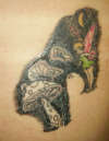
| Is there something over Tink's head or is it just the way the light's hitting the tatt? If there is, what is it? |
 |
Karoline |
2006-09-24 |
| that is NOT good! it is very bad, in fact! sorry.. |
|
Pazz16 |
2006-07-05 |
| A while back you left some strange feedback. You remarked on the orange & purple lines that the artist uses as a guide. Come check out what it looks like now that the lines are done in ink. Thanks for your feedback. Please check all my pieces. |
|
listwithme123 |
2006-06-21 |
| Is that suppossed to be a crescent moon up at the top. It looks more like a banana. |
|
Kirsten |
2006-04-27 |
| My ink looks worse than this? Does your 'artist' have Parkinson's or something? |