|
CoLT MoNSTER |
2010-01-12 |
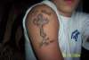
| looks like crayon |
 |
SuperStud666 |
2009-04-04 |
| i judge this tattoo as gay |
 |
nathan |
2008-11-30 |
| dont listen 2 tha haters its real good i barely been doin em a month or 2 so mine aint that good but this is pretty damn good |
 |
Kyle |
2008-09-30 |
| DIFF FONTS, MAKES IT LOOK TRASHY |
|
b |
2007-07-22 |
| why are you asking us to judge this crap?? it's crooked and the lettering is all fucked up |
|
b-real |
2007-04-19 |
| i think gods gonna be very cross with you mate!!! |
|
nicola |
2006-09-25 |
| SKANK |
 |
IndigoblueXtreme |
2006-08-29 |
| why is every word a different font? |
|
myskitten18 |
2006-06-27 |
| I don't if it's the angle you're sitting at but the cross looks a little crooked and your letters look misplaced as well. Good work but a little awkard with the placement. |