|
noheiarchy |
2009-02-03 |
| I dont like it. |
 |
mindy |
2007-06-11 |
| offspring? |
 |
plod |
2006-07-03 |
| i like it - just don't put names of girls or wives in there. |
 |
Jonathan F. |
2005-06-04 |
| Not to impressed with design. Tats look good though. Giving it a 3. |
 |
jennifer <3 |
2005-02-25 |
| hmm well it doesn't really contour your body very well... |
|
martin* |
2004-08-05 |
| Are you planing on filling in the banners with words/names?? |
|
Quil |
2004-07-26 |
| Very old school, unoriginal, faded. Think up something that actually has meaning next time. |
|
Leanna |
2004-05-18 |
| agreed - crap sums it up. |
|
Bart Simpson |
2004-05-14 |
| crap |
 |
Beth |
2004-04-28 |
| Very interesting tat. I give a 6. |
|
ryan jones |
2004-03-21 |
| why did it post twice? |
|
ryan jones |
2004-03-21 |
| and they've both been done by different artists |
|
ryan jones |
2004-03-21 |
| and they've both been done by different artists |
|
ryan jones |
2004-03-21 |
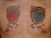
| i never intended 2 hearts originally but a friend said an inverse reflection would look good |
|
good by rate my ink |
2004-03-20 |
| The blue one looks like the work is better. And whats the deal with 2 hearts? What else do you have planned? |