| Welcome guest. Sign In | New User Sign Up | Post Picture | Gallery |
Ink pics

|
Follow @rmipost 
|

 |
Jordan | 2010-05-31 |
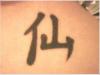
| sorry but it is a little off, check this link out: http://www.tattooica.com/Kina/immortal.gif
Fortunately it isn't so messed up that it can't be fixed, a little touch up and it'll be perfect. Either way, the piece looks nice, clean lines, good tattoo. |
||
 |
bob | 2008-02-02 |
| First of all it's a character not a symbol. Second, the two parts of the character are supposed to be in proportion. One side should not be noticeably bigger than the other. The bottoms should be roughly the same level. | ||
 |
EB | 2007-11-20 |
| it is the way it is cuz of how the symbol is look it up | ||
|
bob | 2007-02-23 |
| The left side is out of all proportion to the right. | ||
|
EB | 2005-08-20 |
| i never said no one else had it, iv just never seen the same thing on any one else. | ||
|
JamesR | 2005-08-12 |
| Ignore Dream0n83, clearly a jack ass.
I love it, nice/neat and meaningful - I just hope you did have it checked ;) |
||
|
Dream0n83 | 2005-06-14 |
| you wouldnt know if someone else had it all those things look the same. And you will never know for 100% if the meaning is real | ||
|
lety | 2004-08-10 |
| i like it. it kinda looks like a pitch fork. NICE >:* | ||
| Signup | Login | Home | Gallery | Search | User Profiles | Help | About | Links |
| Privacy | TOU | Site Map | Contact |
| © 2014 ratemyink.com |