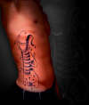
Sweet Jesus!!! Nice lettering, size, and placement. I wish the flow and subtleties of the capital and flourishes were carried into the lowercase characters, but I'm a picky bastard. Either way it all comes together as a great piece.
The lettering is OK but the fill really makes the whole thing come together. I like it overall. I'm glad for you that you didn't go with Old English font, all-caps. Way to be original.
I think it's good but would have been a little more finished if the letters were connected. It looks like they were typed out on a computer without regard for letter spacing. But mad props for location and size!
so i want this tattoo
heres the link to tattoo http://inkbitetattoos.deviantart.com/art/Pain-is-Temporary-176440052
i dont want to completely copy this tattoo how can i make it different and uniqu
It's a home tattoo, (big mistake)
I just wanted to know if i over criticize it or it's really shit.
I have others professionally done, this one's getting fixed soon. I just want honest opinions fro
http://tinypic.com/view.php?pic=izua37&s=5
http://tinypic.com/view.php?pic=2w562vr&s=5
And in my Avi are the only ones where I can find a decent looking shot of it.
It says with hope comes faith,